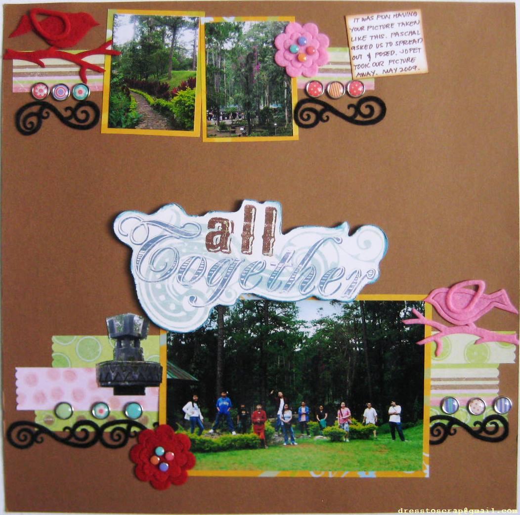
Bedette lifted Maps design from the theme, to the photo placement, the scrolls and the birds. Her choice of pretty felt shapes and brads as embellishments added flair and brightness to her refreshing nature themed page.
Bheng played around with the layout design to come up with a very creative and interesting interpretation of Bedette's page. She clustered the photos with the title and borders to pull the design together and draw your attention to the photos. The common elements was still retained like the photo orientation, the borders, journaling spot, birds and flowers with a twist to bring out a bright and playful page.
Beth's adaptation of Bheng's page is very prominent like the borders, photo and title placement were lifted. To add interest to her page she played around with the embellishments to blend with her theme like the trees, flowers, birds and butterflies which added texture and sweetness to her page.
Jen mixed the elements on Beth's page to suit her style. The earthtone, the nature theme, the trees and the butterflies and the title placement were adapted from Beth's page. She added interesting shapes to the border for layers, intricate cutting of the tree and added masking to add a special touch to define her true style.
Lily also adapted Jen's overall design with the scalloped papers, the baby photos and photo orientation, the title placement and the butterflies. But her use of bright colors and her own cluster of embellishments convey the theme for her pretty baby girl that made the page completely her own.
Marix adapted the overall sketch of Lily's LO with a few twist on changing the title placement and using landscape photos. The prominent clock embellishment, the stamp on the right hand side and the shaped paper was cleverly adapted to transform a pretty baby page into a manly page.